Pranjal Sawai

Brand and Visual System Designer

Designing an Identity That Grows With the Art

A Flexible Brand System for Art Crumbles

Pranjal Sawai

Brand and Visual System Designer

Designing an Identity That Grows With the Art

A Flexible Brand System for Art Crumbles

Most identity systems are designed to protect consistency. A logo goes in a box, colors get locked to hex codes, and every touchpoint is measured against a single "correct" version of the brand. That approach works well when a brand is the only thing being shown.

But what happens when the brand isn't the main character?

Art Crumbles is a location-based app that turns real-world exploration into digital art collecting, and behind every drop, every reveal, every gallery piece sits a different artist, bringing their own style, palette, and story into the experience. The brand's job isn't to be the loudest visual on screen. It's to hold everything else together without competing with it.

That constraint is what led me away from a traditional fixed identity and toward something more like a system: a flexible visual language that could remain recognizable across hundreds of unpredictable, artist-driven contexts, while still feeling like a single coherent product.

This is the story of how that thinking took shape.

What "Flexible Identity System" Actually Means

A flexible identity system isn't the absence of rules; it's a different kind of rule. Instead of one fixed logo lockup, one color palette used the same way everywhere, and one layout template, you design a set of relationships that can recombine.

Think of it less like a single outfit and more like a wardrobe with a dress code. The pieces change depending on the occasion, but they're all clearly pulled from the same closet. For Art Crumbles, that meant defining:

  • A core mark that can shift, not just shrink. The logo needed to hold up whether it's sitting quietly in a navigation bar or animating into a "reveal" moment, without needing a separate treatment built for each case.

  • A color system with a fixed foundation and a flexible accent layer. A small set of primary brand colors remains consistent everywhere for recognition, while a broader secondary palette allows artwork, artist branding, and drop-specific moments to breathe without clashing.

  • A layout grammar, not a fixed template. Rules for spacing, hierarchy, and composition that hold true whether the content is a minimal artist profile or a dense, image-heavy gallery grid.

The goal isn't infinite flexibility; that just becomes chaos. It's bounded flexibility: enough structure for the product to always feel like Art Crumbles, and enough looseness that it never fights with the art it's designed to showcase.

Why This Matters Right Now

Fixed, monolithic identity systems made sense when a brand controlled most of what people saw, packaging, ads, a handful of core screens. That world is behind us, especially for a product like this.

A few shifts make flexible systems essential:

  • Content comes from the community, not the brand. Platforms built around creator-generated work — art, music, video, marketplaces- need identities that support other people's creative output. The brand's strength shows up in how well it holds the frame, not how loudly it fills it.

  • Growth demands adaptability. A platform built to onboard new artists and new drops continuously has to design for inputs it hasn't seen yet. The system needs enough built-in range from day one to absorb what's coming.

  • Audiences expect personalization. People read tailored, context-aware experiences as more premium and more trustworthy today. A system with built-in flexibility delivers that naturally.

  • Speed is a design requirement. New features and formats need to ship on their own timeline. A flexible system keeps pace by design, so shipping speed and brand integrity grow together.

For Art Crumbles, this is the operating model. The product is built to keep adding artists and drops indefinitely, so the identity had to be designed for that scale from the start.

Designing for Longevity: Scaling the System, Not Just the Brand

"Longevity" here doesn't mean unchanging — it means built to scale. The system should get stronger as more artists and drops enter it, not strain under them.

In Figma, this meant designing components as variants with defined flex ranges rather than fixed states. A drop card, for example, is one component with rules for how color, imagery, and spacing can shift per artist — rather than a new card designed for every new style that comes in. Add a new artist, and the card automatically adapts within its rules, with no new design work required.

This scalability matches who the product is for. The audience values discovery and authenticity over polish. A system designed to flex and expand feels like the same energy they're drawn to — alive and a little unpredictable, but still consistent at its core.

Bringing the System Into Art Crumbles

With the framework defined, the next step was applying it across the actual product experience.

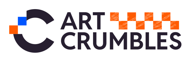
  • The mark. The Art Crumbles logo uses a layered, fragmented "C", a nod to discovery and pieces coming together. Its geometric offset blocks are designed to hold up at small sizes (navigation, icons) and to animate cleanly at key moments, like a reveal, without needing a separate custom version each time.

  • The palette. A tight primary set- deep blue, black, and warm off-white- anchors every screen and keeps the product instantly recognizable. A secondary palette of brighter accent colors (orange, purple, teal, yellow) is reserved for artist content, drop states, and moments of discovery — giving room for variety without diluting the core brand.

  • Typography and hierarchy. A bold, condensed display type carries titles and key moments, while a simpler, quieter type handles supporting content. This contrast lets artwork and artist-driven content remain visually dominant, while the product's own voice remains legible beneath.

  • Component behavior over fixed screens. Discovery cards, reveal moments, and gallery entries were built as flexible components with defined ranges for color, imagery weight, and spacing — rather than one-off screens. This meant new drop types or artist formats could be supported without a redesign each time.

Each of these decisions traces back to the same principle: give the product a consistent spine, and give the content room to breathe.

What This Enables Going Forward

The real measure of this system isn't how it looks in a first set of mockups; it's whether it still holds up as the product grows into territory it hasn't reached yet. A flexible identity means new artists, new drop formats, and new features can be designed and shipped without reopening the brand conversation each time.

For a product built around discovery, that matters. The identity doesn't compete with the art; it makes room for it while still giving the whole experience a consistent, recognizable center. That balance is the actual design problem worth solving: not "what does the brand look like," but "how does the brand behave as everything around it keeps changing."

Most identity systems are designed to protect consistency. A logo goes in a box, colors get locked to hex codes, and every touchpoint is measured against a single "correct" version of the brand. That approach works well when a brand is the only thing being shown.

But what happens when the brand isn't the main character?

Art Crumbles is a location-based app that turns real-world exploration into digital art collecting, and behind every drop, every reveal, every gallery piece sits a different artist, bringing their own style, palette, and story into the experience. The brand's job isn't to be the loudest visual on screen. It's to hold everything else together without competing with it.

That constraint is what led me away from a traditional fixed identity and toward something more like a system: a flexible visual language that could remain recognizable across hundreds of unpredictable, artist-driven contexts, while still feeling like a single coherent product.

This is the story of how that thinking took shape.

What "Flexible Identity System" Actually Means

A flexible identity system isn't the absence of rules; it's a different kind of rule. Instead of one fixed logo lockup, one color palette used the same way everywhere, and one layout template, you design a set of relationships that can recombine.

Think of it less like a single outfit and more like a wardrobe with a dress code. The pieces change depending on the occasion, but they're all clearly pulled from the same closet. For Art Crumbles, that meant defining:

  • A core mark that can shift, not just shrink. The logo needed to hold up whether it's sitting quietly in a navigation bar or animating into a "reveal" moment, without needing a separate treatment built for each case.

  • A color system with a fixed foundation and a flexible accent layer. A small set of primary brand colors remains consistent everywhere for recognition, while a broader secondary palette allows artwork, artist branding, and drop-specific moments to breathe without clashing.

  • A layout grammar, not a fixed template. Rules for spacing, hierarchy, and composition that hold true whether the content is a minimal artist profile or a dense, image-heavy gallery grid.

The goal isn't infinite flexibility; that just becomes chaos. It's bounded flexibility: enough structure for the product to always feel like Art Crumbles, and enough looseness that it never fights with the art it's designed to showcase.

Why This Matters Right Now

Fixed, monolithic identity systems made sense when a brand controlled most of what people saw, packaging, ads, a handful of core screens. That world is behind us, especially for a product like this.

A few shifts make flexible systems essential:

  • Content comes from the community, not the brand. Platforms built around creator-generated work — art, music, video, marketplaces- need identities that support other people's creative output. The brand's strength shows up in how well it holds the frame, not how loudly it fills it.

  • Growth demands adaptability. A platform built to onboard new artists and new drops continuously has to design for inputs it hasn't seen yet. The system needs enough built-in range from day one to absorb what's coming.

  • Audiences expect personalization. People read tailored, context-aware experiences as more premium and more trustworthy today. A system with built-in flexibility delivers that naturally.

  • Speed is a design requirement. New features and formats need to ship on their own timeline. A flexible system keeps pace by design, so shipping speed and brand integrity grow together.

For Art Crumbles, this is the operating model. The product is built to keep adding artists and drops indefinitely, so the identity had to be designed for that scale from the start.

Designing for Longevity: Scaling the System, Not Just the Brand

"Longevity" here doesn't mean unchanging — it means built to scale. The system should get stronger as more artists and drops enter it, not strain under them.

In Figma, this meant designing components as variants with defined flex ranges rather than fixed states. A drop card, for example, is one component with rules for how color, imagery, and spacing can shift per artist — rather than a new card designed for every new style that comes in. Add a new artist, and the card automatically adapts within its rules, with no new design work required.

This scalability matches who the product is for. The audience values discovery and authenticity over polish. A system designed to flex and expand feels like the same energy they're drawn to — alive and a little unpredictable, but still consistent at its core.

Bringing the System Into Art Crumbles

With the framework defined, the next step was applying it across the actual product experience.

  • The mark. The Art Crumbles logo uses a layered, fragmented "C", a nod to discovery and pieces coming together. Its geometric offset blocks are designed to hold up at small sizes (navigation, icons) and to animate cleanly at key moments, like a reveal, without needing a separate custom version each time.

  • The palette. A tight primary set- deep blue, black, and warm off-white- anchors every screen and keeps the product instantly recognizable. A secondary palette of brighter accent colors (orange, purple, teal, yellow) is reserved for artist content, drop states, and moments of discovery — giving room for variety without diluting the core brand.

  • Typography and hierarchy. A bold, condensed display type carries titles and key moments, while a simpler, quieter type handles supporting content. This contrast lets artwork and artist-driven content remain visually dominant, while the product's own voice remains legible beneath.

  • Component behavior over fixed screens. Discovery cards, reveal moments, and gallery entries were built as flexible components with defined ranges for color, imagery weight, and spacing — rather than one-off screens. This meant new drop types or artist formats could be supported without a redesign each time.

Each of these decisions traces back to the same principle: give the product a consistent spine, and give the content room to breathe.

What This Enables Going Forward

The real measure of this system isn't how it looks in a first set of mockups; it's whether it still holds up as the product grows into territory it hasn't reached yet. A flexible identity means new artists, new drop formats, and new features can be designed and shipped without reopening the brand conversation each time.

For a product built around discovery, that matters. The identity doesn't compete with the art; it makes room for it while still giving the whole experience a consistent, recognizable center. That balance is the actual design problem worth solving: not "what does the brand look like," but "how does the brand behave as everything around it keeps changing."

Let’s chat!!!

A passionate, award-winning visual storyteller seeks a full-time position to channel expertise into creating compelling narratives through design.

Profile portrait of a man in a white shirt against a light background

Pranjal Sawai

Creative Brain Behind Brilliant Designs

Extreme close-up black and white photograph of a human eye

Let's Contact

Let’s chat!!!

A passionate, award-winning visual storyteller seeks a full-time position to channel expertise into creating compelling narratives through design.

Profile portrait of a man in a white shirt against a light background

Pranjal Sawai

Creative Brain Behind Brilliant Designs

Extreme close-up black and white photograph of a human eye

Let's Contact

Let’s chat!!!

A passionate, award-winning visual storyteller seeks a full-time position to channel expertise into creating compelling narratives through design.

Profile portrait of a man in a white shirt against a light background

Pranjal Sawai

Creative Brain Behind Brilliant Designs

Extreme close-up black and white photograph of a human eye

Let's Contact